Mobile site coming soon!
Feel free to enjoy my portfolio in its unencumbered glory on desktop :)
Giving a streetwear shop the personality to become a local cultural force
As a small store with great products and lots of potential, Stax seemed like the perfect candidate for an overhaul of their design assets and aesthetic. My goal was to paint Stax as a taste-making, trend-focused entity worthy of appearing on Hypebeast.com.
Stax serves as East Austin's hub for sneaker, streetwear, and vintage culture. Their quaint brick-and-mortar shop carries hot items from many of the same sneaker and clothing brands that you normally only find on websites like Stock-X, as well as a small selection of their own Stax-branded pieces like t-shirts and hats.
When it comes to clothing and fashion, aesthetic is everything — in other words the design IS the product — which is why it felt important to create a look that was cutting-edge and visually impactful. The result is versatile design language based on a clean and futuristic wordmark.


A new grid-based display typeface has entered the chat
Using a simple grid pattern, I discovered a unique effect that makes for some interesting letterforms.
Once I developed the system for spacing, widths, and overall structure, the full character set came together very quickly. The grid is surprisingly versatile, and only a few letterforms had to be finessed to work within it.
The font works well at a smaller size but really shines when blown up. The effect is punchier, more dynamic, and creates a stunning relationship between form and content.


An exercise in visual language
After holding my pencil awkwardly for 25+ years I decided it was time to make a change, and what better way to practice my new grip than to go through the entire alphabet one letter at a time and write them over and over? And while we're at it, why not use this as opportunity to experiment with drawing the letters too?
For several months my Field Notes booklet became a playground for letterforms and visual language, with handwriting practice on the left and creative practice on the right. Early into this process I became more interested in the creative part than the handwriting part, and my goal was to see how diverse I could be in my approach to each letter – how unique I could make each one from one another. The focus was not the letterforms themselves so much as the visual treatment.
The handwriting practice was fruitful as well, except for the fact that I've since abandoned that new grip in favor of my quirky original.


A collection of expressive graphics made to order
One-off side projects are a great way for me to flex my creativity and have fun with very low stakes. I've been blessed with the opportunity to work on a range of projects for both friends and colleagues, whether it be flyers, album covers, or other miscellaneous visuals.


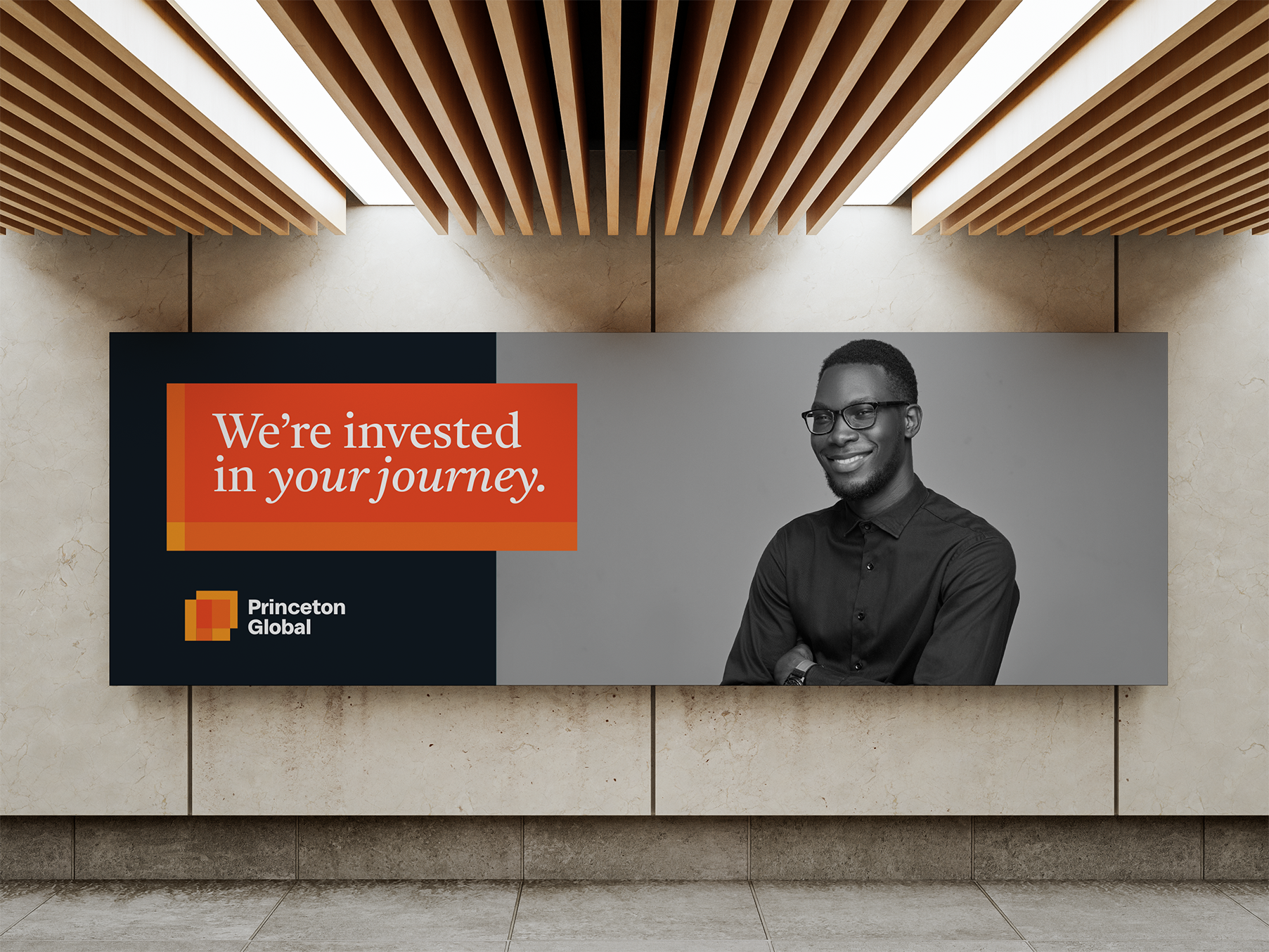
Putting a fresh coat of paint on a global asset management group
Scope: Keeping their existing mark the same, our goal was to refresh the logo, build an entire new visual identity around it, and ultimately translate it into a website refresh.
My Role: Lead designer, with creative direction and guidance from the team at JK Design
Princeton Global is a reputable asset management organization for affluent individuals and families. They pride themselves on the personal relationships they build with their clients, such that you feel like you are partners with a person and not a corporation.
Following the initial process of renewing voice and messaging guidelines, the new visual identity had to reflect the same tone by being warm, trustworthy, and personable. The headshot-style photography puts focus on the personal one-on-one nature of their work, while the tree ring pattern subtly communicates growth and generational wealth.


Helping an iconic brand communicate their sustainability efforts
Scope: Establish a look and feel to accompany Caterpillar's sustainability communications – to be passed off and executed internally.
My role: One of two designers on the project, with creative direction and guidance from the team at JK Design
As the world's leading manufacturer of construction and mining equipment, Caterpillar wanted to vocalize their position in the sustainability conversation. Our strategy department spent a number of weeks working closely with the Caterpillar team, identifying their specific goals and needs in this area, and distilling a vision for their sustainability brand. We learned that for them, it was less about making an emotional appeal to the environment, but rather a commitment to helping their customers meet industry guidelines.
When it came to the visual identity system, we entertained three possible paths. 1.) We could adhere closely to the Caterpillar corporate brand, leveraging photography do be the driver of their sustainability look, 2.) We could build off the corporate brand, picking strategic ways to twist existing brand elements to signal sustainability, or 3.) We could take things in a whole new direction, giving their sustainability communications a distinct vibe of their own.
Our initial exploration revealed that option 2 felt the best path for Caterpillar. Keeping their primary color palette in tact, we introduced some new fonts, patterns, and accent colors. Most importantly however, we gave their sustainability brand an ownable visual motif that accompanies the tagline "Engineered for evolving times". The motif, which appears in a number of ways throughout the design system, visually represents progress, evolution, and movement. It also subtly resembles a battery or electric charge, which made sense with their migration toward clean energy and electric engines.
Although the work never saw the light of day, we created an identity system that was bold, flexible, and hit a number of checkboxes for Caterpillar.


Giving a financial services organization a much needed facelift
Scope: A total overhaul of the brand’s visual identity, starting with the logo
My Role: Lead designer, with creative direction and guidance from the team at JK Design
BPM offers three main services – tax, assurance, and advisory. So for the logo, we explored a lot with the idea of three pieces coming together or interlocking somehow. Also, BPM stands for “Because People Matter”, and so wanted to work in this theme of human-centered and personal touch.
Several rounds over budget later, we landed on a mark that communicates three distinct forces and hints vaguely at the image of a thumbprint. We continued to build out from there, solidifying a color palette, determining a style of photography, and introducing other brand elements such as patterns and gradients.


Celebrating the merger of two eCommerce platforms with a new look and feel
Scope: Develop a new logo and accompanying visual identity to be used consistently across branded materials
My Role: One of two designers on the project, with creative direction and guidance from the team at JK Design
Bravo Commerce is the product of two B2B services — Unilog Content Services and Bravo Business Media — joining forces. Together, the two are able to offer a full-service eCommerce solution that helps mid-market hardware and industrial supply stores sell their products online. Think Shopify but for the mom-and-pop version of Home Depot.
The logo and visual identity for this type of service needed to feel sturdy and unpretentious in order to connect with storeowners, likely tradesmen who may not be as comfortable around technology. The challenge then became how do we brand a software and eCommerce platform in a way that isn’t flashy and doesn’t get lumped in with start-up or other tech companies.


Marks that leave a mark
Throughout my career I’ve had the pleasure of designing logos for scrappy startups, large corporations, and everything in between. While many of these projects involved a full visual identity as well, this page serves as a logo hall of fame for some of my most effective designs.
Brainstorming, iteration, and refinement are all cornerstones of my design process, and never more so than with branding and logo design.
There are any number of factors that make for an effective mark, but I find that distinctiveness, elegance, and versatility are the hallmarks of any great logo.


Giving grief a place to go
Scope: Design a deck of cards and associated packaging for a new wellness product and therapy tool, creating a look and feel that can expand into a greater brand.
My Role: Dedicated graphic designer (freelance)
AshBath Insight Cards aim to help those experiencing grief from loss of a loved one. Through a series of prompts (akin to the game ‘We’re Not Really Strangers’), players are encouraged to reflect on their memories, on their emotions, on the notion of death itself.
Inspired by the memory and legacy of her own father’s passing, the client came to me to help bring her vision for a more comfortable and healthy grieving process to life. Given the somber subject matter, we wanted to keep the brand to feel soft, approachable, and not too flashy. Through the minimal use of tastefully selected brand elements, we achieved a visual identity that is soft spoken yet full of character.


Winning the poster competition for my senior year at design school
Scope: Design a poster to serve as promotion for the 2017 poster show at ASU’s design school, and extend it into the branding for the entire event
My Role: Poster design and art direction for the entire event, overseeing the consistency of event materials being made by various teams of students
As part of ASU’s Visual Communication Design Program each year, the senior class puts on a poster show selling donated posters to raise money for the design program. The event is designed and organized entirely by the senior design students, and one of the first steps each year is to determine the branding for the show.
Each student designs a poster to promote the event, then the entire design program, students and faculty, vote to determine the poster for that year’s show. My submission was chosen, meaning that not only was my poster used on campus and social media to promote the event, but it also became the visual language for the signage, labels, bid sheets, and more.


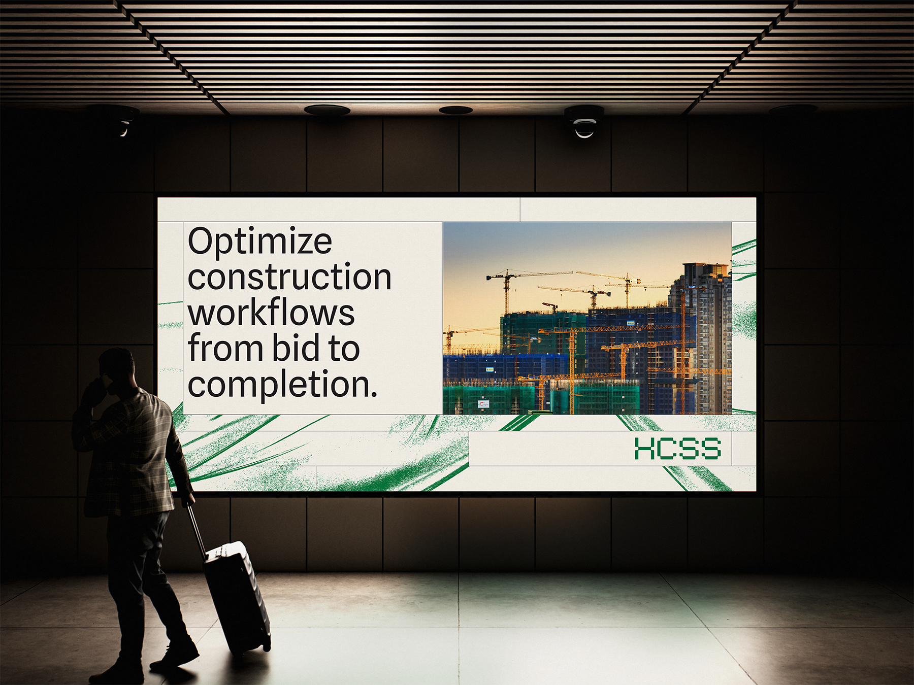
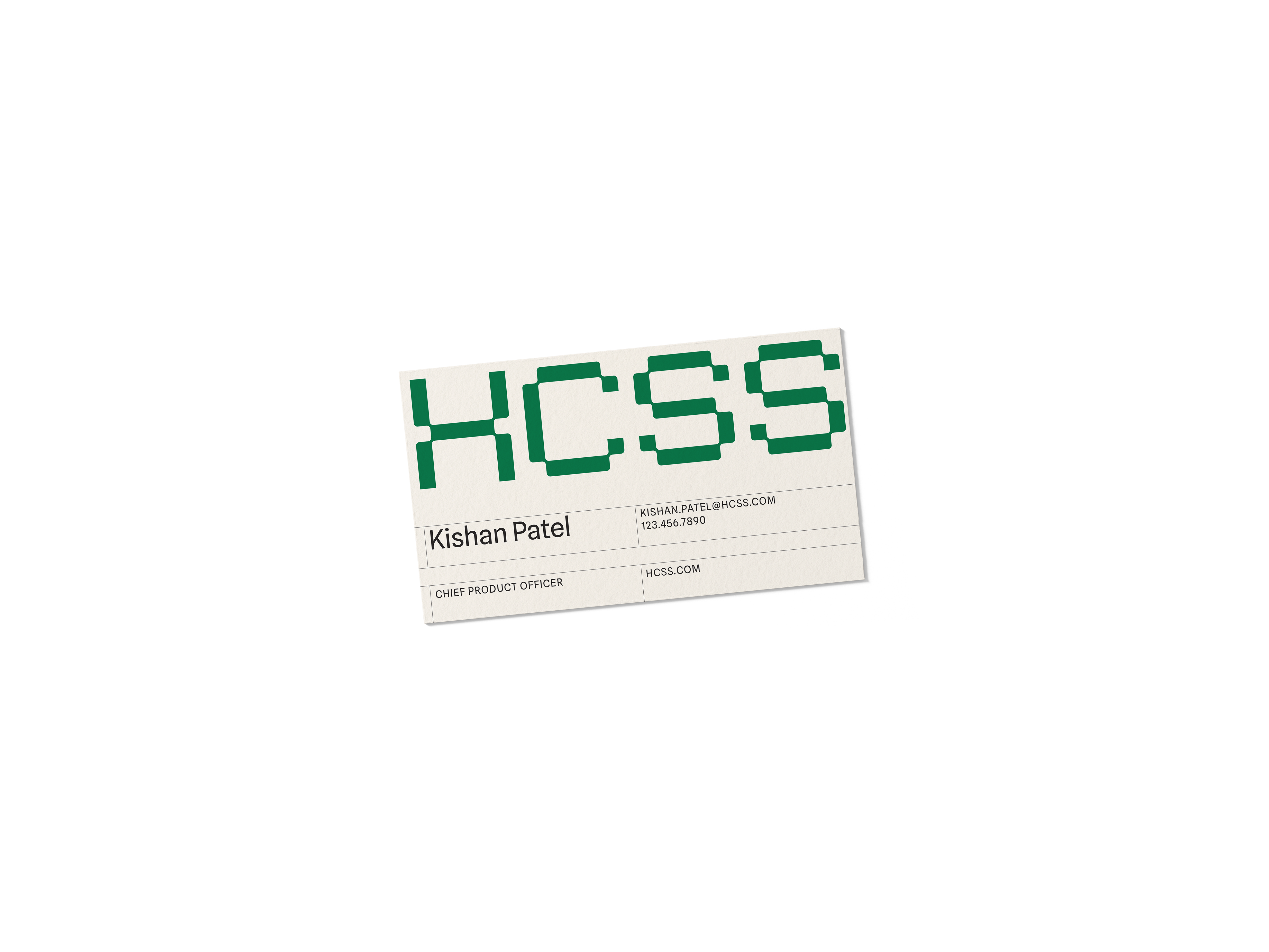
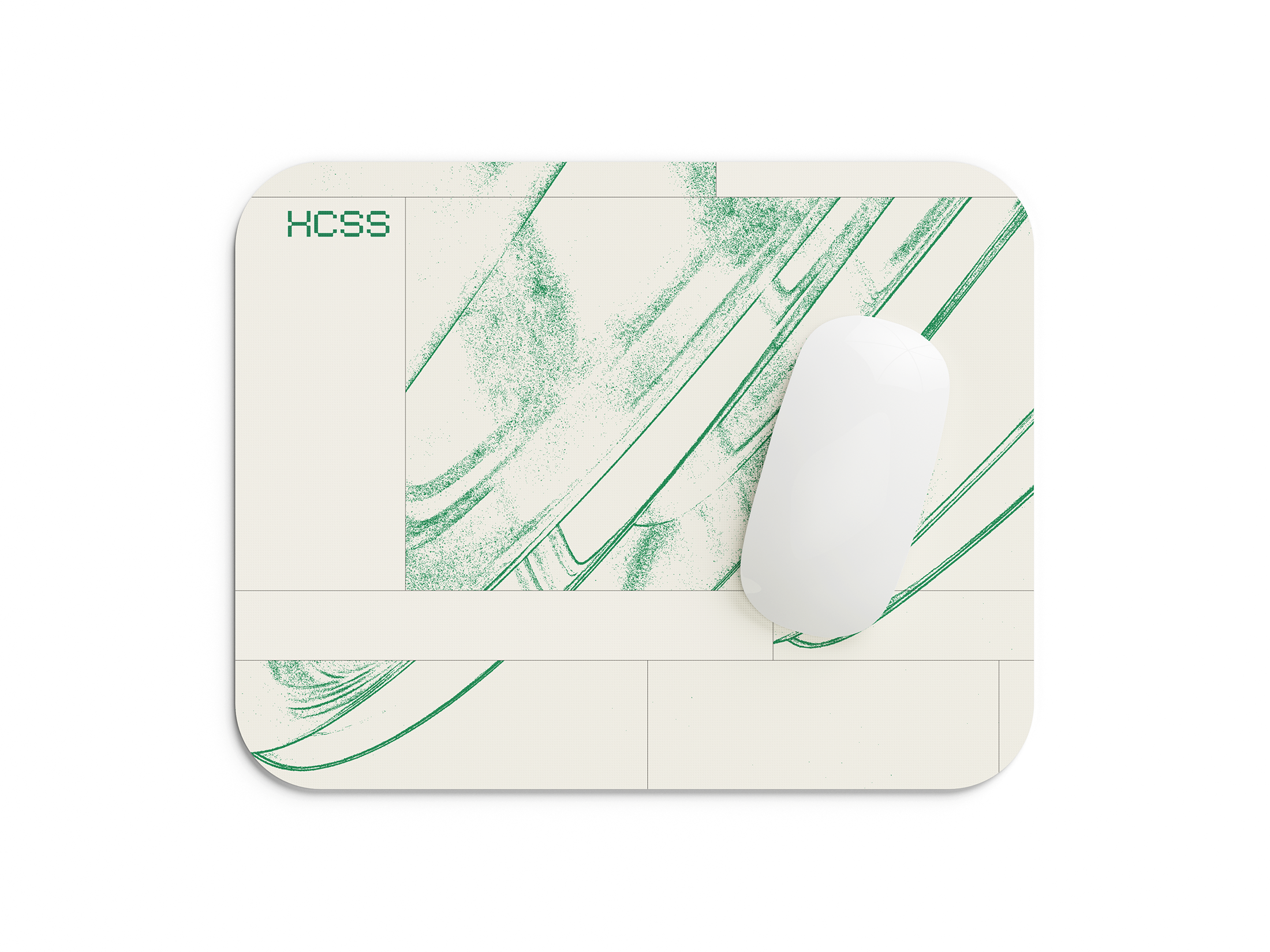
The imaginary rebrand no one asked for.
As a way to demonstrate the depth and breadth of my branding chops, I chose to execute a self-initiated clean-slate rebrand for a B2B company that I selected at random. I asked ChatGPT to generate a creative brief for the rebrand based on information from the company's website so I would have clear goals and objectives to work with, then used those insights to develop a strategic and conceptually-driven design system.
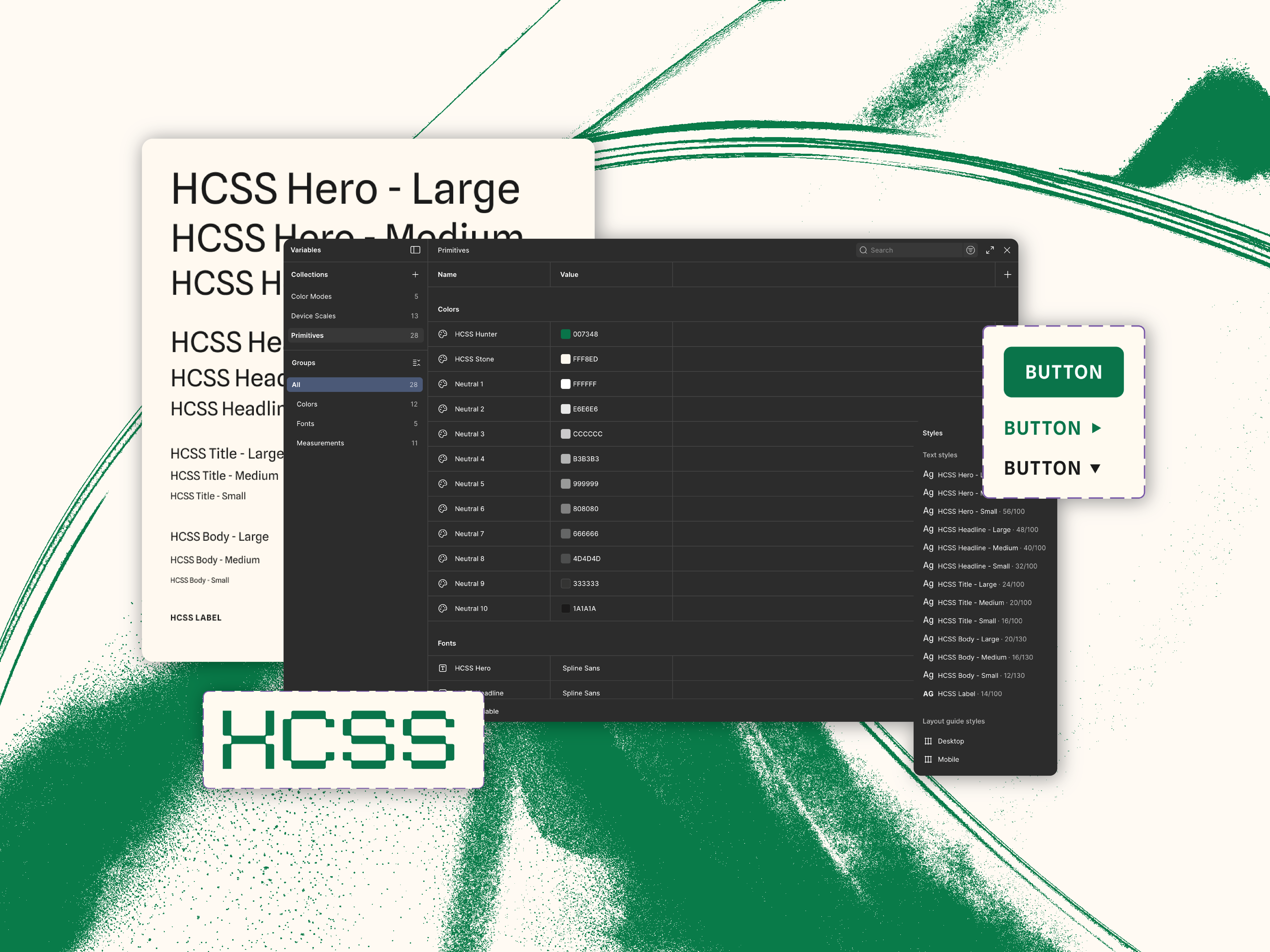
HCSS, which does need a rebrand, offers software that helps civil, infrastructure, and utility contractors improve bidding, project execution, safety, fleet management, and data visibility. The brief (shown right), calls for things like modernization, increased market differentiation, and a new sense of trustworthiness and innovation.
This refreshed visual identity addresses HCSS's needs in a multitude of ways:
A simplified color palette and effective use of white space gives the visual identity a cleaner look and positions HCSS as a modern and reliable software solution.
A structured logotype gives the brand strength and helps it feel right at home in the construction and blue-collar space.
An innovative grid pattern gives the brand a distinct and memorable character, while communicating ideas of flexibility and structure. Its resemblance to building blocks is a nod to both the construction of buildings as well as HCSS's suite of integrated tools and software.
A textured background treatment visually distinguishes HCSS from its competitors by introducing a more human and tactile element in an otherwise cold and tech-y market.
The minimal and strategic use of powerful brand elements like these allows for flexibility while maintaining consistency a cross every touchpoint, thus elevating a strengthening the HCSS brand.
Creative Brief — HCSS Rebrand (from ChatGPT)
Project Overview
HCSS is embarking on a clean-slate rebrand to elevate its market presence as the gold standard in construction technology — modernizing its identity to reflect innovation, industry leadership, and deep customer trust while more clearly articulating complex software solutions for diverse contractor audiences. The rebrand should unify visual and verbal expressions across all touchpoints (digital, sales, events, product UI, documentation, and internal culture) to support strategic growth, global expansion, and recruitment efforts.
Company Background
HCSS has been helping heavy civil, infrastructure, and utility contractors improve bidding, project execution, safety, fleet management, and data visibility through integrated software since 1986. The company’s suite includes products like HeavyBid, HeavyJob, HCSS Safety, Equipment360, HCSS Plans, and telematics tools that connect office and field operations. HCSS is recognized for innovation, technical depth, and exceptional support — a trusted partner to thousands of contractors nationwide.
Business Objectives
• Clarify and modernize the brand architecture to better communicate the breadth and sophistication of HCSS software.
• Increase market differentiation in a crowded construction tech landscape, positioning HCSS as visionary yet pragmatic.
• Elevate digital presence and storytelling to clearly convey product value and outcomes (e.g., productivity, safety, profitability).
• Support recruitment and talent attraction, reinforcing HCSS as an innovative and people-centric technology employer
Target Audiences
Primary Audiences:
• Construction Estimators and Project Managers — seeking tools that streamline bidding, project execution, scheduling, and cost controls.
• C-Suite and Operations Leaders — focused on ROI, safety outcomes, workforce productivity, and digital transformation.
• Fleet & Safety Managers — requiring reliable, real-time equipment and compliance insights.
Secondary Audiences:
• Prospective employees and tech talent — developers, product leaders, designers attracted to purpose-driven tech companies.
• Industry partners and system integrators — ecosystem collaborators supporting integrations and partner innovations.
Core Value Proposition
HCSS powers construction excellence through industry-specific software that connects office and field, enabling contractors to bid smarter, manage better, and build safer, more profitable projects.
Brand Attributes
Trusted & Proven: Decades of field-tested solutions adopted by leading contractors.
Human-Centered: Exceptional support (24/7) and a culture built on respect, growth, and service.
Innovative & Forward-Thinking: Continually evolving products and customer-informed development.
Practical & Results-Driven: Focused on measurable outcomes — productivity, safety, and profitability.
Iteration is king
The importance of a thorough process has been drilled into me from my first year of design school, where our final review was 10% presenting our final work, and 90% presenting the countless exploration, iteration, and refinement that was involved in each project.
Since then I have carried that process-driven mentality into every creative project, f
When it comes to clothing and fashion, aesthetic is everything — in other words the design IS the product — which is why it felt important to create a look that was cutting-edge and visually impactful. The result is versatile design language based on a clean and futuristic wordmark.

My name is Jordan, I’m a graphic designer and visual storyteller with 7+ years of agency experience. I have strengths in branding and visual identity, with some additional experience in marketing, web, and motion design.
Work
Senior Designer @ JK Design
March 2022 — April 2025
Graphic Designer @ Fervor Creative
May 2018 — March 2022
Design Intern @ Oshin Studios
June — July 2017
Marketing Manager @ Sun Devil Fitness Center
April 2016 — May 2018
Education
B.S. in Visual Communication Design from ASU
2013 — 2018
Other
Online Instructor of Technology for Design @ ASU
2022 — Present
Online Instructor of Principles of Graphic Design I & II @ ASU
2023 — Present